Tuesday, 28 January 2014
Set Design - Bluescreen [1]
For the set design, we wanted something that looked professional and that matched the theme with our logo. We considered using one of the logo's that I originally used however we decided to use the one a different one on my USB stick, that is a virtual set. This one looks a lot better and very proffessional.
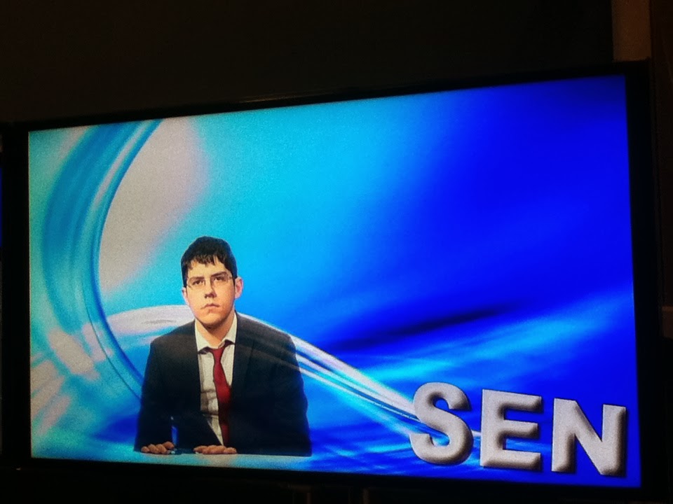
This way, the background looks professional and it matches with our colour scheme. The small TV's in the background are also animated. We tested this look out and it worked well. Below is James positioned on the left of the bluescreen screen so that he appears next to the 'tv' and the third image shows someone testing the old SEN logo. The news background looks a lot better. We are going to put the SEN logo on the TV.
For the presenting, when James is standing up, we decided to use a real TV then. We thought that it would look good with James standing up. It also shows some of the team working behind him. We had a bit of difficultly with the light reflecting in the window, however we managed to block the lights reflecting. On the TV, we'll be having the SEN logo. (The logo comes out well on the TV however the photo doesn't show it.)
Subscribe to:
Post Comments (Atom)


No comments:
Post a Comment